Archived on 2019.09.09
If you have ever played a game released by SEGA, you surely remember their iconic blue logo.
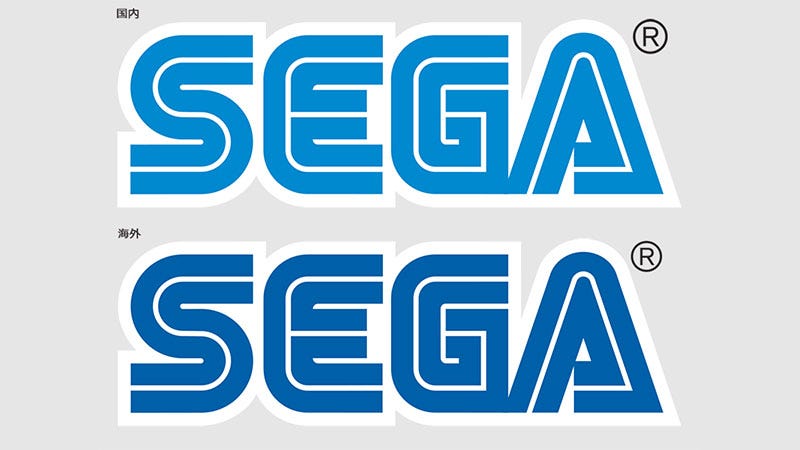
However, have you ever noticed that this logo looks a little different depending on the region your game was released in?
意外と知られてない気がするんですが、セガのロゴは国内と海外で色が少し違います。並べてみるとわかるんですが、受ける印象がちょっと違いますよね。 pic.twitter.com/THC3FCwcaL— 北尾雄一郎/Yuichiro Kitao (@kit_p) August 23, 2019
Gem Drop's head and game designer Yuichiro Kitao-san addressed this differences between SEGA logo used in Japan and international products, and this tweet gathered attention of many Twitter users and people from the gaming industry, including Naka-san.🔵 Fun fact: Did you know that the color of SEGA logo is different between Japan and overseas?— ●SonicJPNews● (@SonicJPNews) August 23, 2019
Top: Japanese logo with light blue color
Bottom: international logo with darker blue color https://t.co/tSUD4YkrtN
↓ ↓ ↓
